The WHY behind our logo

We believe in intentional design, in everything we do, starting with our Logo and Brand Name.
When I first started my clothing line, I chose my name, Allison Izu, which was special to me because "Izu" is my middle name, given by my grandfather. He was a graphic artist who loved the beauty of the Izu peninsula in Japan, and it’s always been a part of my identity.
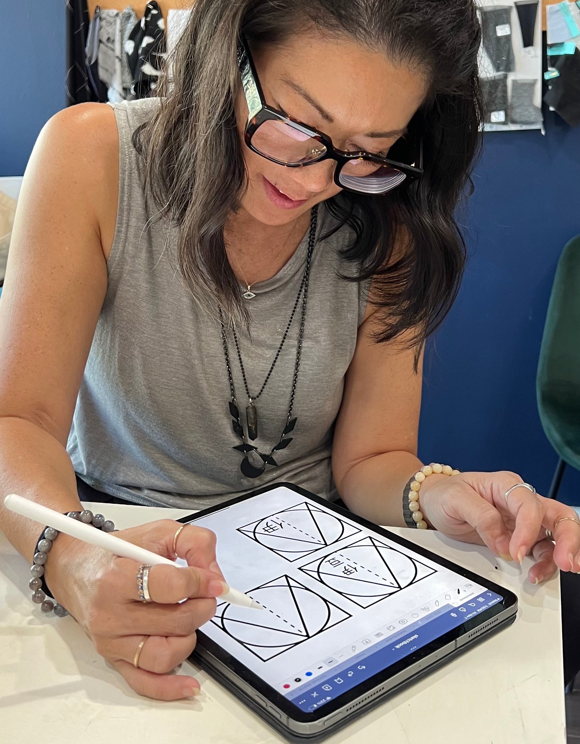
In 2022, after shifting the brand’s focus to online and downsizing our physical space, I wanted a logo that would symbolize this new direction. I found a company that created a logo using the letters of my name. The design incorporated spiritual elements—shapes like the circle, triangle, and square—that align with Zen philosophy, representing the interconnectedness of all things. The Circle is for Unity, the Triangle for Ascension, and the Square is Solidarity.
Earlier this year, I felt it was time for another change. I consulted a friend and intuitive guide, realizing the logo needed refinement. The original design's line in the middle felt divisive, so I reworked it into a stitch, symbolizing both the craft of clothing and the way we, as a brand, connect people and ideas.
The last piece that was missing was the beginning of this story, the IZU, placed in the bottom right side of the logo, as a sort of Hanko or signature. The name is derived from the place, which is Izuru - meaning "spirit" and having a deeper connection to the hot springs that pop up around the Izu peninsula.
This new logo not only honors the past but also embodies our brand’s future intentions of unity, ascension, and solidarity.
-Allison


Comments